 : a web tool for visualizing clustering of multivariate data (BETA) - custom edition
 : a web tool for visualizing clustering of multivariate data (BETA) - custom edition
Number of annotation levels in the original data before filtering:
Metsalu, Tauno and Vilo, Jaak. Clustvis: a web tool for visualizing clustering of multivariate data using Principal Component Analysis and heatmap. Nucleic Acids Research, 43(W1):W566–W570, 2015. doi: 10.1093/nar/gkv468.
Data matrix size:
Missing values (NAs) in rows:
Missing values (NAs) in columns:
Metsalu, Tauno and Vilo, Jaak. Clustvis: a web tool for visualizing clustering of multivariate data using Principal Component Analysis and heatmap. Nucleic Acids Research, 43(W1):W566–W570, 2015. doi: 10.1093/nar/gkv468.
Download processed data as CSV-file
Download PCA scores as CSV-file
Download PCA loadings as CSV-file
Download PCA explained variance as CSV-file
Metsalu, Tauno and Vilo, Jaak. Clustvis: a web tool for visualizing clustering of multivariate data using Principal Component Analysis and heatmap. Nucleic Acids Research, 43(W1):W566–W570, 2015. doi: 10.1093/nar/gkv468.
General
You can move through the analysis steps by going to each of the tabs from left to right. All tabs work in a similar way: you can choose settings from the left panel, image or table on the right will automatically renew after that. Sometimes, it can take seconds to load. When moving from one tab to another, settings are saved automatically.
In general, different tabs provide the following options:- Data import - choose input dataset, option to filter rows/colums based on annotations and transpose matrix
- Data pre-processing - option to aggregate columns with similar annotations, remove rows/columns with missing values, row centering and scaling, method for calculating principal components and imputing missing values
- PCA - options related to PCA plot
- Heatmap - options related to heatmap
- Export - create link with current settings, download intermediate results
The idle timeout (the time when browser session ends if user is inactive) is set to 30 minutes from server side but this can be overridden by browser configuration. To save uploaded data and selected settings, you can use a button on the 'Export' tab, a link is given to recover the settings later. This can also be used to send a link to a collaborator to show the same view. There is no planned expiration time for the links, users can delete the settings if they are concerned about the privacy. Though, when version of ClustVis changes, old saved settings may not be fully compatible with the new version if e.g. there are some new features.
Data import
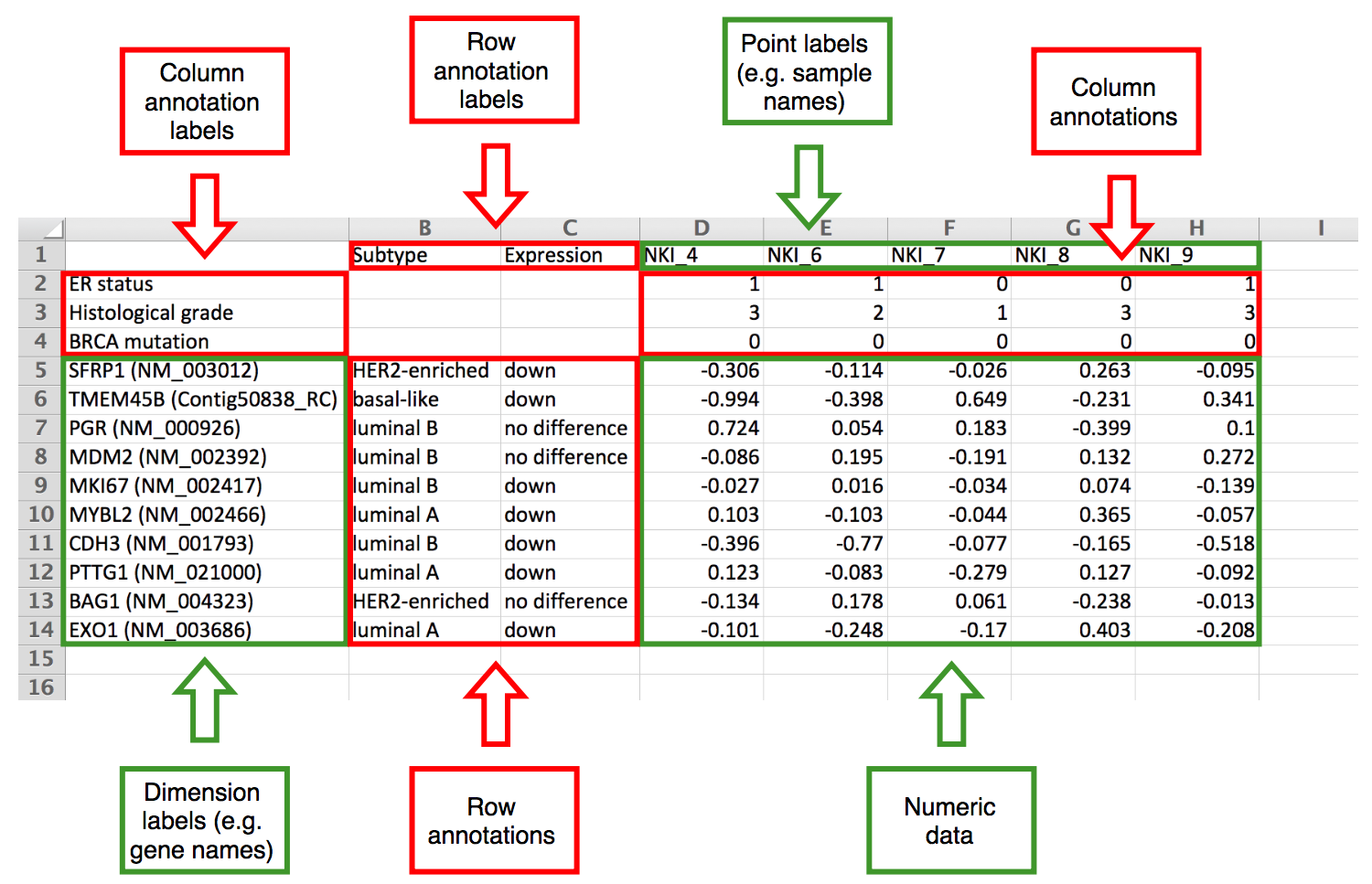
We aimed for a simple input data format. The numeric data matrix is situated in the bottom right corner, dimensions presented in rows and points in columns. Row labels and annotations are left from the matrix, column labels and annotations are above the matrix. Annotation labels are in the first row and column, respectively. Format of the input file is shown on the image below. Annotations are optional, data sets without annotations can be uploaded as well (on the example image, omitting rows 2-4 and/or columns B and C). When taking data from spreadsheet program (e.g. MS Excel), you can copy-paste the data to 'Paste data' box or export the data as delimited text file (ending with .csv or .tab) and then upload this file to ClustVis. Uploading Excel native files directly (.xls or .xlsx) doesn't work.

In addition, it is possible to load settings that you have saved earlier (including data, drop-down settings etc.) or import data from MEM which has a collection of public datasets from ArrayExpress. The latter case is described more closely in the next section. It is also possible to use one of the testing datasets to get an overview of the web tool.
If your dataset is not uploaded correctly (no rows are shown), please check the following:
- Make sure file is chosen for upload or pasted to the text box.
- Make sure all rows have equal number of columns. In case of doubt, it is safer to open the data in a spreadsheet program and copy-paste from there rather than choosing a file for upload.
- Make sure there are no duplicate row or column names.
- Make sure all missing values are marked with NA or empty cell.
- If automatic detection of the delimiter is not working correctly, try to set it manually (uncheck the 'detect delimiter' checkbox).
- If automatic detection of the column and row annotations is not working correctly, try to set it manually (uncheck the 'detect column and row annotations' checkbox).
For user-uploaded datasets, ClustVis automatically detects both delimiter and number of annotation rows from the data by default. To find delimiter, it counts for each possible delimiter (comma, tabulator, semicolon) how many times it appears on each row. We use the heuristic where minimum is taken over all rows and the delimiter with the greatest score is chosen as the right one.
When finding number of annotation rows and columns, the largest possible numeric matrix from bottom right corner is found. If the matrix contains non-integers (i.e. fractional numbers) and there are some left columns or top rows that contain integers only, these first rows and/or columns are considered integer-valued annotations (e.g. some grade coded with integers: 1, 2, 3).
The situation is depicted on the following images where there are three annotation lines and the green and red line show automatic detection. On the left, the numeric matrix contains non-integer values and the last annotation row is detected correctly. On the right, the numeric matrix contains only integers and the last annotation row cannot be detected automatically.

Public dataset from MEM
If you select this option, you can choose one dataset at a time. There are four options to filter the number of rows shown:
- Select one KEGG or Reactome pathway or GO biological process. In case of some rare platforms, it can happen that gene IDs don't convert correctly and no data is shown.
- Select a custom gene list. IDs are automatically converted using g:Convert tool.
- Cluster the genes using k-means. The number of clusters is provided by the user. Cluster ID and number of genes in each cluster is shown on the heatmap labels.
- Choose one of the k-means clusters. This options should be preceded by clustering with k-means and choosing a cluster of interest from the heatmap.
If it happens that some names are very long and make the plot small, you can manually increase the width of the plot. We decided not to truncate the names automatically because sometimes the start of the name is important, sometimes the end and it is hard to decide it automatically.
You can search for dataset and pathway by typing one or more keywords to the search box and then select from drop-down list that appears. The keywords can be about body part, dataset ID or any other word that appears in the experiment title. All available datasets and pathways are summarized in the tables below.
List of datasets available
List of pathways available
Annotations based filtering
After choosing a dataset, it is possible to filter out rows or columns based on annotation levels. By default, all levels are included, you can uncheck them one by one or click 'change all levels' and then check some of the levels to be included. Each level has a number in brackets that shows the number of rows or columns in the full dataset having this level. If multiple annotations are used for filtering, a subset is retained that meets all filtering criteria.
Data pre-processing
On this tab, you can choose the method that is used for PCA. This method is also used for imputing missing values to the heatmap and it also determines, for example, whether values on the heatmap are centered or not. Number of components returned depends on the dimensions of the input data matrix. If there are more observations (n) than dimensions (d) then d principal components are calculated. Otherwise, the number of principal components is n.
In general, SVD (Singular Value Decomposition) is the standard PCA method that is most often used. Imputation means that if there are any missing values in the dataset, they are predicted and filled iteratively using other values in the dataset during SVD calculation. Other PCA methods are further strategies to cope with the missing value problem.
Unit variance is the most common scaling method. This means that all variables are scaled so that they will be equally important (variance = 1) when finding the components. As a result, a difference of 1 means that the values are one standard deviation away from each other, or from the average of the row if rows are centered.
If the variables already have a common scale and you want to keep their original variability (i.e. variables where the variability is larger should contribute more to the components), you can apply 'no scaling'.
When exactly to use some other PCA method (Nipals, probabilistic) or scaling (Pareto, vector scaling) is a matter of testing with each specific dataset. Interpreting the results of PCA and heatmap plots is quite subjective and needs further validation using other methods.
PCA and heatmap
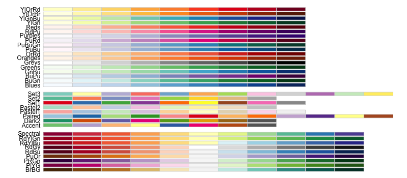
These are the main tabs, allowing you to generate and customize PCA plot and heatmap. Each individual setting is described more precisely with a tooltip that appears if you hover over with the mouse. To download an image, you can use one of the buttons above the plot. The following color palettes from ColorBrewer are available:

Only up to eight color groups are allowed on the PCA plot because human eye cannot distinguish more colors easily. In this case, shapes should be enough for separating the groups. The following shapes are used:

If there are more groups than available shapes, some groups are not shown on the plot.
Interactivity of the plots
With the recent updates of the tool, interactive mode was added to both PCA plot and heatmap which allows to click and hover over specific areas of the plot. This mode is available when going to PCA or heatmap tab and choosing 'change plot labels', 'add interactivity'. Interactivity is still experimental, we are hoping to get feedback from users. It is not made the default option because plots are slower to render. It is recommended to first set other options in non-interactive mode and then switch to interactive mode as the last step. For larger datasets where an interactive plot would take too long to render, it is automatically switched to non-interactive mode and a warning message is shown.
Interactive mode includes the following additional options:- Hover over a point on the PCA plot to see additional information.
- Click on a point on the PCA plot to see values from one column on a separate jitter plot. If 'plot_link' appears among column annotations, the points are linked to an external resource instead.
- Hover over a row name, column name or cell on the heatmap to see additional information.
- Click on a row name, column name or cell on the heatmap to see values from one row, column or cell on a separate jitter plot.
- Hover over a point on the jitter plot to see additional information.
- Click on a point on the jitter plot to go to an external resource. It is only available if there is a row or column annotation called 'plot_link'.
- Click on a column name on the jitter plot to see a reduced jitter plot with values from only this column.
The default tooltips can be overridden by having a row or column annotation called 'plot_tooltip'. Below the jitter plot, a table is shown that includes all data on the plot and, in addition, information about missing values. Row and column IDs in the table are changed into links if 'plot_link' appears among annotations.
Interpreting the output
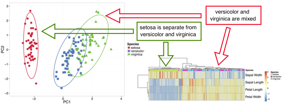
Principal Component Analysis performs a linear transformation to turn multivariate data into a form where variables are uncorrelated (see Jolliffe, Ian. Principal component analysis. John Wiley & Sons, Ltd, 2002). These new uncorrelated variables are called Principal Components and they are ordered descending based on the variance explained. Thus, first two components show the data from the angle of most variability, i.e. they create the most "widespread" 2D projection. They also approximate the distances between points. Thus, if ellipses on the PCA plot are not overlapping, these groups form separate clusters.
However, one should be careful when first components describe just a small proportion of the total variation. In this case, approximating original data with 2D projection can be misleading.
The opposite happens when there are only two dimensions in the original data, resulting in 100% of the variation to be explained by the two components. In this case, PCA doesn't make much sense and making a simple scatterplot would be better to interpret in most cases.
Sometimes, first components are related with technical variation such as batch effect, in this case, it makes sense to look at further components that can be attributed to more informative sources of variability.
Heatmap is another popular way to visualize a data matrix. Values in the matrix are color coded and optionally, rows and/or columns are clustered. When looking at the annotations on top of the heatmap, one can get an overview which annotated groups are separated better than others.
When reading the clustering on heatmap, attention should be paid which objects are merged into clustering tree first, not the exact order of rows and/or columns. Any two branches can be swapped without changing the meaning of the tree.
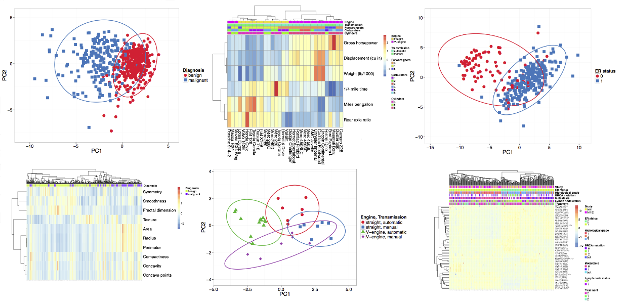
An example output and its interpretation is shown below:

Mathematical basis
Calculation of principal components is thoroughly explained in the book by Ian Jolliffe (see Jolliffe, Ian. Principal component analysis. John Wiley & Sons, Ltd, 2002).
Hierarchical clustering of the heatmap starts with calculating all pairwise distances. Objects with the smallest distance are merged in each step. Clustering method defines how to go from object level to cluster level when calculating distance between two clusters.
Available clustering distances:- correlation - Pearson correlation subtracted from 1
- Euclidean - square root of sum of square distances
- maximum - greatest absolute difference between coordinates
- Manhattan - sum of the absolute differences
- Canberra - weighted Manhattan distance
- binary - matrix is binarized (non-zero to 1, zero to 0), number of bits which are 1/0 or 0/1 divided by number of bits which are 0/1, 1/0 or 1/1
- single linkage - using two closest objects from two clusters to be merged
- complete linkage - using two farthest objects
- average - average distance of all possible pairs
- McQuitty - average distance of the two clusters (to be merged) to the cluster of interest
- median - median distance of all possible pairs
- centroid - distance between cluster means
- Ward linkage - using sum of squared differences from points to centroids as the distance
Separate editions
There is a separate ClustVis edition available which has higher limits for size of the uploaded data.
Also, a Docker image is available in Docker Hub which makes it easier to run ClustVis locally. See GitHub page for more information about the local installation.
If you want to automate ClustVis plot generation, the best way is to use ClustVis R package. See GitHub page for more information.
Metsalu, Tauno and Vilo, Jaak. Clustvis: a web tool for visualizing clustering of multivariate data using Principal Component Analysis and heatmap. Nucleic Acids Research, 43(W1):W566–W570, 2015. doi: 10.1093/nar/gkv468.
Version history:
20th December 2018 - fixed a bug when clustering is not applied on heatmap (thank you, Niladri Bhusan Pati, for letting us know about it!).
17th December 2018 - added some text to help page.
10th December 2018 - added option to export data using ClustVis R package.
29th October 2018 - fixed a bug with transposing input matrix.
15th October 2018 - added option to change margin ratio for PCA plot.
8th October 2018 - added option to change quote and missing value type in the input data.
1st October 2018 - added option to apply logarithmic transformation to the original data.
21st May 2018 - ClustVis plots can now we generated using an R package, see GitHub page for instructions.
19th February 2018 - major code refactoring to separate main functions; fix a bug about setting PCA plot axis limits (thank you, Abby Benninghoff, for letting us know about it!); values outside color range on the heatmap are now appearing with the same color as the color range min or max (thank you, Abby Benninghoff, for the idea!); option to change heatmap legend colors added.
11th December 2017 - some bug fixes and optimizations.
23rd October 2017 - updated Shiny server version and several packages. Decreased minimum heatmap plot width.
4th April 2017 - added option to use grayscale colors for PCA plot groups (thank you, Julian R. Marchesi, for the idea!).
13th February 2017 - fixed a bug when reading in a dataset with both integers and non-integers in the numeric matrix.
30th January 2017 - added ClustVis logo.
16th June 2016 - increased the maximum number of heatmap annotation levels for large data edition; a small bug fix.
3rd May 2016 - there is now a separate edition of ClustVis with higher limits. Also, a Docker image is now available in Docker Hub which makes it easier to run ClustVis locally. See GitHub page for more information about the local installation.
17th February 2016 - option 'change all levels' for annotations based filtering, jitter plot x-axis names link to reduced jitter plot, table is shown now below jitter plot, now always adding links to heatmap cells if row and column names have them, automatic calculation of jitter plot height improved, font of the interactive plots changed to Arial, fixed jitter plot tooltips with NA values and jitter plot with aggregated values, option to show violin plot or box plot without points, 'Data upload' tab renamed to 'Data import' to better reflect the meaning, slightly modified heatmap caption text, loading message added if calculation is in process, general logic of the tabs added to the help page, fixed showing filtering options after transposing, external links open on a new tab without necessarily holding down 'Ctrl' key, annotations with many levels removed automatically from the heatmap.
18th January 2016 - fix 'show imputed values' to show scaled heatmap when unchecked, option to use a custom gene list when subsetting ArrayExpress dataset, message about gene names that were not present in the dataset, limit for maximum number of components to be calculated (for performance reasons), warning message about maximum uploaded file size added, pathway genes sorted alphabetically, shiny package updated to 0.13.
8th January 2016 - major restructuring: interactive mode introduced (see help page), row annotations introduced (thank you, Sven-Eric Schelhorn, for the idea!), extended input file format and related changes to allow row annotations for the heatmap (including row filtering, different detection of annotation lines, modified help page), colored labels for annotation based filtering, annotation groups introduced, option to remove rows and/or columns with many missing values, option to remove constant columns, option to transpose heatmap, option to show missing values on heatmap, option to set general font size on heatmap, font of annotation legend automatically scaled down if it doesn't fit to the plot, option to add space between clusters on heatmap, corrected Ward linkage method added, some data format checks and warning messages, limit for maximum number of annotation levels shown on PCA plot and heatmap, footer changed into a link, Shiny Server updated to 1.4.1.759 and Shiny package updated to 0.12.2, some custom changes in the pheatmap R code merged to the main branch of pheatmap R package.
27th May 2015 - ClustVis is now running on Docker; reference to published article added to the footer.
21st April 2015 - option to transpose the data matrix added under 'Data upload'; maximal heatmap dimension increased to 1200; a small bug fixed related with uploading a dataset without annotations.
17th April 2015 - second revision based on comments from reviewers: number of species increased to 17; more informative error messages for data upload; number of NAs in rows and columns is shown during upload; help page improved (including list of all datasets and pathways).
6th April 2015 - small improvements related with option 'import prepared gene expression matrix'.
1st April 2015 - major revision based on comments from reviewers: some example datasets removed; it is possible to cluster whole gene expression dataset first using k-means or select one k-means cluster; some warning messages added; Bayesian PCA removed; PCA and heatmap options grouped; percentages shown together with axis labels; color and shape can be changed independently on PCA plot; help page improved a lot; example captions added for PCA plot and heatmap; new export options added; heatmap default color changed.
9th February 2015 - some optimization and help text added when importing dataset from ArrayExpress.
6th February 2015 - heatmap tree ordering options added; it is possible to choose different linkage method for rows and columns of heatmap; you can choose color range of the heatmap manually; heatmap annotation titles can be switched off; organism filtering added when importing public datasets; some bug fixes.
19th December 2014 - output interpretation added to the help page; better default size for row and column names on the heatmap.
18th December 2014 - you can aggregate similar annotations on 'pre-processing' tab; you can hide row and/or column names on heatmap; you can set minimum number of annotations when choosing from the list of public datasets.
15th December 2014 - column filtering for all import options added; number of annotations added to dataset name; more flexible plot width.
4th December 2014 - improved search for MEM datasets (you don't have to choose platform or pathway database first). Filtering option of less informative annotations and sample filtering added.
21st November 2014 - import from MEM added; some new example datasets; improved help page; number of rows and columns is now shown on upload tab.
14th November 2014 - option to download plot in different formats added; line type and width for ellipses added.
12th November 2014 - option to save settings added; and some other new features.
31st October 2014 - first version online.
